
Almost a year ago I took a trip of a lifetime to Peru to celebrate graduating from graduate school. One of the most memorable parts of the trip was when I visited Machu Picchu. I took thousands of photos during the ten day trip, but this photo was one of my favorites.
 I knew it had to be turned into a quilt, so when we announced the solids challenge in the Boston Modern Quilt Guild, I decided this was my opportunity to make this into a quilt.

Not wanting to do an exact interpretation or make an art quilt, I started cutting a ton of 1" strips out of five different brown fabrics and sewed them together. I ended up making three different groups of these brown strips, one with the strips horizontal, one vertical and one on the diagonal. I varied the width and length of all three as part of my interpretation of the photo.
 I decided on a teal background instead of a more natural green that's found in nature. Again, this was my way of modernizing the quilt and avoid looking too much like an art quilt. When it came time to quilt it, I knew I wanted to quilt straight lines opposite the direction of the brown strips. It took me a little while to settle on echoing the brown sections, which ended up giving the quilt a 3-D look.
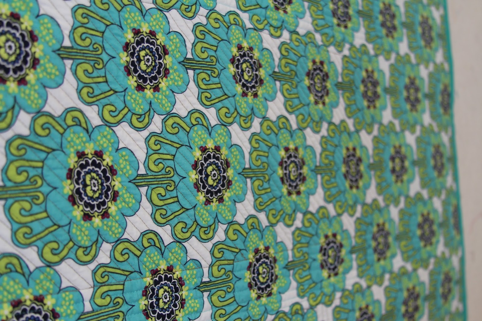
 I used an Art Gallery print from my stash on the backing that I thought went well with the top. I quilted it using gold and teal Aurifil threads. The batting is Quilters Dream Cotton Select. The solids are Michael Miller Cotton Couture.
Overall, I'm pleased with this quilt and it will definitely remind me of my trip to Peru every time I look at it.


Not wanting to do an exact interpretation or make an art quilt, I started cutting a ton of 1" strips out of five different brown fabrics and sewed them together. I ended up making three different groups of these brown strips, one with the strips horizontal, one vertical and one on the diagonal. I varied the width and length of all three as part of my interpretation of the photo.

Overall, I'm pleased with this quilt and it will definitely remind me of my trip to Peru every time I look at it.


